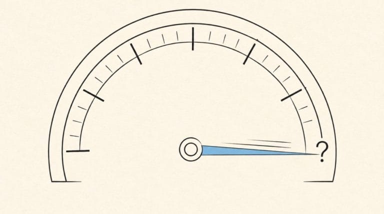
You sat down at 9pm on a Sunday. The draft was already written. You hit “paste into beehiiv” and watched 45 minutes evaporate.
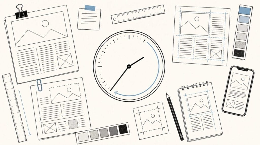
Ten minutes resizing the hero image because it looked stretched on mobile. Ten more, rearranging two content blocks because the order felt wrong after you saw it rendered. Eight minutes hunting for the dark gray that matched the one in your last issue, because the swatch picker did not remember it. Five minutes on font weights. Five on the CTA button alignment. Five on the test send to yourself, then the second test send because the first preview cut off the preview text. Two minutes on the link check.
45 minutes. On work nobody will praise you for. On a layer of the publication that, if it works, is invisible to your readers.
Your subscribers do not subscribe to the formatting. They notice when it is broken. They never notice when it is correct.
That asymmetry is the entire problem.
The hours I have written about so far in this series have been the visible hours. Source monitoring. Story selection. The work that happens after the draft is finished. Formatting is the layer that most operators have stopped counting because they assume there is no fix. Last Tuesday, we launched HeyNews to the public, and the platform finished eighth on Product Hunt for the day. The launch was the close of a year that produced a body of evidence about exactly this layer of newsletter production. Today’s post pulls the formatting layer out into the light, with numbers.
How Long Does It Actually Take to Format a Newsletter?
The honest answer depends on whether you count what most operators do not count.
The Email Marketing Industry Census, summarized by Blocks Edit, puts a typical email campaign at 8 or more hours of design and content production, plus an additional 2 hours of mobile optimization. That figure is for marketing teams. Designers, developers, QA support, brand guidelines are drilled into every team member. Ten hours of formatting and design work per email, distributed across multiple specialists.
Solo newsletter operators do that ten hours of work alone. Or, more often, they compress it to 45 minutes by accepting visible compromises that nobody else on a marketing team would tolerate.
The 45 minutes are split across five recurring tasks for every issue.
Task 1: Layout structuring. Deciding section order. Block sizes. Whether this week’s three-story format is two columns or one. Whether the deep dive belongs above or below the link roundup. Most operators iterate this in their head, then in the editor, then in mobile preview. Ten minutes, sometimes twelve.
Task 2: Image handling. Sizing. Cropping. Alt text. Verifying the image renders without distortion across email clients. The vertical photo needed to be square. The horizontal one that needed to be cropped to a 2:1 ratio. Eight to ten minutes per issue is the typical floor.
Task 3: Typography and color consistency. Bold weights. Body colors. Header treatment. Most ESPs do not enforce the color values you set six months ago, so you choose them from memory or from your last sent issue every time. Five to seven minutes.
Task 4: Mobile and dark mode preview. Switching the editor view. Resending tests. Discovering that the dark gray paragraph text is now invisible against the dark mode background. Five to eight minutes when nothing breaks. More when something does.
Task 5: Link and CTA verification. Clicking every link in the test sends. Confirming the CTA goes where you meant it to. Checking the unsubscribe link works. Five minutes if you do it. Zero if you skip it. The skipped version is the one that produces the Sunday morning emergency.
Add the five tasks together and the math works to forty to fifty minutes, with most issues landing close to 45. This is the formatting tax. It is invisible on your calendar, because the calendar doesn’t have a block called “fixing the gray paragraph again.” But the bill is paid every single week.
What Makes Email Formatting Resist Every Productivity Fix?
The standard answer is “more templates.” The real answer is more uncomfortable.
Chad S. White at Litmus, in the most-cited analysis on this question, originally calculated approximately 15,000 potential renderings for any single email send. The figure assumed five major factors: email service provider, operating system, email client, screen size, and image state. Conservative math.
White has since updated the estimate. The current figure is over 300,000 potential renderings per email.
Three hundred thousand.
Read that number again. Then count how many email clients you actually open before hitting send. For most solo operators, the answer is two. Mobile Gmail. Desktop Apple Mail. Maybe a third if they are paranoid about Outlook.
That gap between 300,000 and 2 is the structural condition that makes formatting feel infinite. You are testing 0.0007% of the surface where your email could break. The other 99.9993% is faith.
Litmus’s research also found that email clients make changes as often as every 1.2 days. That is the cadence at which the conditions under which your email renders are quietly shifting. Every 1.2 days, somewhere, an inbox provider modifies how it handles a CSS property, an image format, a font fallback. You did not get a press release. The change still happened. Your next send is exposed to it.
The most important sub-problem inside the rendering problem is dark mode. According to research summarized by Knak, nearly 82% of smartphone users have dark mode enabled on at least one device. Among Android users specifically given the option, 81.9% turn it on. Most of your audience is reading on a device that is going to recolor your email after you send it.
The kicker is that no two email clients handle dark mode the same way. The Pathwire and Ascend2 “Email After Dark” survey found that 31% of senders cite automatic color inversion as their biggest dark mode challenge. The same survey reported that 72% of senders have dark mode on their radar and 44% actively design for it at least some of the time. Which means more than half of senders, including most solo operators, are shipping into dark mode environments they have never deliberately tested.
Your newsletter has approximately 300,000 ways to render. You are testing in two. The other 299,998 are how subscribers actually open it. Sad.
How Do You Make a Newsletter Look Consistent Across Issues?
This is the part most operators have never quantified, which is why it eats them alive.
Formatting consistency operates across two dimensions, and most operators only see the first one. The first dimension is whether one issue renders correctly on Gmail mobile right now. The second dimension is whether issue 37 looks like issue 36 looks like issue 35, in font weight, in color hex, in section structure and in image treatment. Voice consistency gets all the attention in the newsletter conversation. Visual consistency is the silent sibling, doing similar relational work and is paid no attention.
The cost is real and measurable. The Lucidpress State of Brand Consistency Report, drawn from a survey of more than 400 brand professionals, found that organizations expected a 10 to 20% growth uplift if their brand was consistently maintained. A follow-up of the same study, summarized in PR Newswire, put the figure at up to 33% revenue uplift for organizations with consistent brand presentation across touchpoints. The same study found that 81% of companies still deal with off-brand content in their own publications.
A weekly newsletter is 52 opportunities a year to be on brand or off brand. Most solo operators land somewhere in the middle. Header color drifts. The CTA button shape shifts. The hero image cropping ratio changes between this issue and the last issue because you forgot which crop you used last time. None of these drifts triggers a single unsubscribe by itself. The compound version is what your most engaged subscribers feel as “this feels different from how it used to feel.”
Brand consistency operates as a structural property that your readers experience as ‘this looks like the same publication I subscribed to.’ The slogan version of the phrase undersells what is actually doing the work on the page.
Eren wrote about voice drift from the creative side. The visual version of the same drift works the same way. The reader doesn’t email you, “Your gray got slightly more blue.” They unsubscribe quietly on a Tuesday morning that nobody marks.
No judgment. The tools were not built to enforce this. Most ESPs do not save your last issue as the template for your next one in a way that locks in every visual decision. The drift is the default behavior. Of course, you can copy your last issue and try to modify the draft, but this certainly won’t save you any time. 45 minutes are still there for you to pay. Also, the possibility of accidentally forgetting to change one section? One sentence? This chills every newsletter owner to the bones.
Why Templates Alone Do Not Solve It
The standard answer to formatting friction is “use templates.” The reason the answer keeps falling short is that a template is a snapshot of a single moment, while production runs on a system that must repeat that moment 52 times a year.
Email designers have known this for years. The serious version of the fix is modular email architecture, where every reusable section of your email is its own already coded and tested module, and your email gets assembled from those modules rather than rebuilt from a master template each issue.
The time savings are documented. Chad S. White, the same Oracle Marketing Consulting analyst whose rendering math you read earlier, estimates that modular email architecture reduces production time by 25 to 40%. At the high end of that range, a Stripo case study captured in Email Mavlers’ analysis reported that one customer’s email digest production dropped from 2.5 hours to about 30 minutes after switching to a modular design. A five times speed gain on the same task, same human, different architecture.
The reason solo newsletter operators have not gotten those gains is that modular email architecture was built for enterprise email teams with developers. The setup cost involves coding HTML modules, defining variables, building a library of components, governance rules and version control. For a solo operator publishing weekly, the setup work alone would consume two months of issue production time before the system produces a single time saving.
The math does not pencil out at the solo operator scale. Which is why most solo operators stopped trying.
The unbuilt opportunity was always a system that delivered modular consistency benefits without the modular setup tax. A system that reads your past issues, learns the structure you already use, and applies that structure forward with zero configuration work from the operator.
That is the design problem HeyNews was built around.
What Did the Launch Week Actually Prove?
We opened the trial to the public last Tuesday, May 12. The platform finished eighth on Product Hunt that day, launching alongside teams we have respected for years. Eren wrote the longer reflective piece on what the launch meant after a year of internal use. The architectural version is shorter.
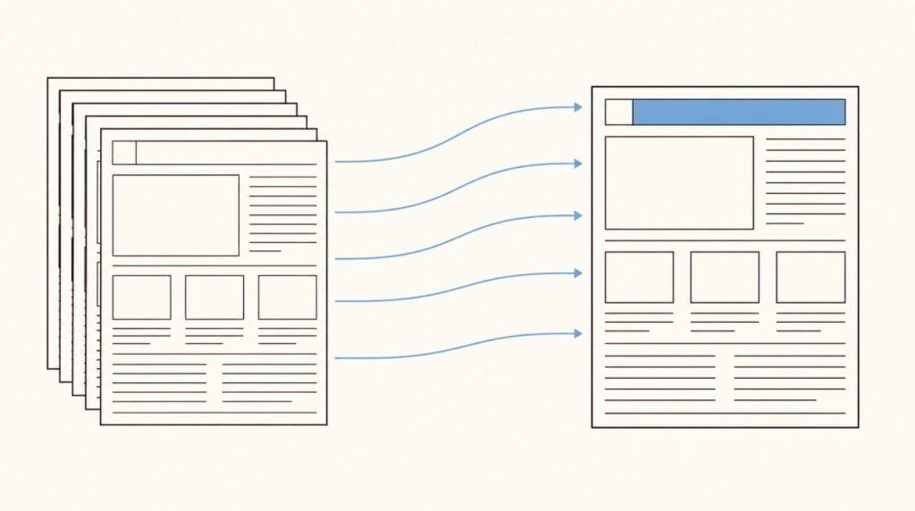
HeyNews connects to your newsletter platform through the beehiiv API, Kit through OAuth, or any platform with a public archive URL, including Substack, Ghost, Mailchimp, and Medium. The connection takes under a minute. Once connected, the platform reads your past issues and builds a voice profile that includes your tone, your vocabulary, your sentence patterns, your section structure, and your signature phrases.
Read that list again, specifically the third and fourth items. Section structure. Signature phrases. Those are the formatting fingerprints that drift across issues when you’re working alone at 10pm.
When the AI Writer generates a new draft, it is generating against your archive’s structural patterns. The number of stories per section, the way you typically open with a context paragraph before the first link block, the order in which you present a deep dive versus a link roundup, and the recurring metadata patterns at the top and bottom of every issue. These get learned once, from the archive, and applied forward to every draft the system generates. Per section story counts let you lock in how many items each section should hold. One click transforms (shorten, expand, formalize, simplify), handling the structural revisions that previously ate ten minutes of layout work per issue.
The platform doesn’t send your email. That stays with your ESP. What it does is hand you a draft already formatted to your patterns, clean enough that pasting it into your ESP takes a minute instead of forty.
The 5-minute final review that survives is the one you should keep. Final visual QA, mobile preview and the link check. Those are the parts that need your eyes. The other 40 minutes that used to live in template adjustment, structural decisions, and consistency repair are work the system can do faster and more consistently than a tired human at 10pm on a Sunday.
The launch pricing is open until June 30. Use the code WELCOME50 to get HeyNews at the following pricing: Hobbyist at $19.50 per month, includes 5 issues per month for one publication. Starter at $49.50 gives you 15 issues per month for 2 publications. Pro at $149.50 covers 45 across 4 publications. And lastly, if you run a media company, Team at $249.50 provides 90 issues across 10 publications.
After June 30, standard pricing returns at $39, $99, $299, and $499 for Starter, Pro, and Team. The trial runs for 14 days with 5 generated drafts before the subscription decision. So you don’t pay anything to try it out.
How Do You Audit Your Own Formatting Time This Week?
You do not need to subscribe to anything to diagnose this. You need fifteen minutes and your next issue.
Step 1: Time the formatting layer specifically. From the moment your draft is written to the moment you hit send, mark a stopwatch. Subtract any time spent on subject line iteration or on writing the actual content. What is left is the formatting layer. Most solo operators land between 35 and 55 minutes here.
Step 2: Categorize the time. Use the five buckets above (layout structuring, image handling, typography and color, mobile and dark mode preview, link and CTA verification). Allocate each minute to a bucket. Most operators find that two of the five buckets eat the majority of the time, and the specific two buckets are different for every operator.
Step 3: Compare against your last three issues. Open the sent versions of your three most recent issues in your ESP’s archive view, side by side. Look at the headers. The hero image treatment. The body copy color. The CTA button. Note every visual element that drifted between issues. The drift count is the consistency leak in your workflow.
Most operators discover one of two patterns in this audit. Either the formatting time is uniform and the consistency is drifting, or the consistency is locked, but the formatting time is climbing. Both patterns point to the same structural problem. The system you are running on doen’t remember your last issue when you start the next one. Every issue is a fresh decision tree, every Sunday.
You aren’t alone in finding this pattern. Every solo operator we have talked to discovers the same one when they run the numbers.
In a Nutshell
- Newsletter formatting consumes roughly 45 minutes per issue across five recurring tasks: layout structuring, image handling, typography and color consistency, mobile and dark mode preview, and link verification. The time is invisible on most production calendars because the tasks are small individually.
- Email rendering complexity is the structural cause. Litmus’s research documents over 300,000 potential renderings per email and inbox provider changes every 1.2 days on average. Solo operators typically test in two to three environments, leaving the rest to faith.
- Brand consistency drift across issues is the silent compound problem. The Lucidpress State of Brand Consistency Report found that organizations with consistent brand presentation see up to a 33% revenue uplift, and that 81% of companies still ship off-brand content in their own publications.
- Modular email architecture reduces production time by 25 to 40%, according to Oracle’s Chad S. White, with documented case studies showing fivefold speed gains. The setup cost has historically priced solo operators out of the architecture. A system that learns structural patterns from the archive collapses the setup tax to zero.
- You can run a 15-minute formatting audit on your next issue: time the formatting layer specifically, categorize the time across five buckets, and compare the visual treatment of your last three sent issues for drift. Most solo operators find that two buckets eat the majority of the time and that visual consistency has drifted further than they expected.
The newsletter formatting layer is the part of your production workflow that no one will talk about at a conference. It is also the part that’s eating 45 minutes of your Sunday every single week, 52 weeks a year. Annualized, that is the better part of a working month spent on layout decisions that a system could make faster, more consistently, and without the cognitive cost of doing it at 10pm.
The launch was last Tuesday. The trial is open. The proof step is your own publication.
Start your 14-day free trial. Your archive. Your voice. Your formatting, finally consistent across every issue. Here: heynews.co